Button
A button can be included on a page, defining the characteristics by modeling its properties.
The element properties are represented by icons in its context menu, where its operations are also available.
Subtypes
•Primary
•Secondary
•Tertiary
Structure Properties
The structure properties panel of an element opens when selecting the icon  of the context menu.

Alignment
Allows to align the element by selecting one of the available icons.
• Align to the left.
• Align to horizontal center.
• Align to the right.
• Align up.
• Align vertical center.
• Align bottom.
Size
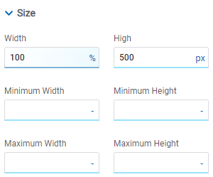
All size properties can be expressed in pixels (px), percentage (%), viewport width (vw), and viewport height (vh). Additionally, for Width and Height properties, the “auto” option is added.
Position Type
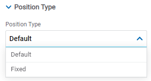
Possible Values
•Default: The element has a relative position with respect to the superior element where it was placed (container or section).
•Fixed: Fixes the element to the page so that it is always visible in the same position. It allows to increase the visibility of important content.
Docking
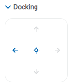
Determines the vertical and horizontal position of elements within the page section or container, when the screen is resized.
Although the modeler automatically docks the element when it is added, it can also be configured in order to be docked to any side (to the top, bottom, left, right, or even in the center of the section or container it is in). Just click on the arrows or in the center of the side to be docked to.
Margins

It allows to define the distance of elements from the borders of their top element. The behavior of margins depends on the docking of the element. It can be expressed in pixels (px), percentage (%), viewport width (vw), and viewport height (vh).
Top
Distance to the top border of the highest ranking element.
Bottom
Distance to the bottom border of the highest ranking element.
Left
Distance to the left border of the highest ranking element.
Right
Distance to the right border of the highest ranking element.
![]() Allows the value entered in one of the margins to be copied to the other ones automatically.
Allows the value entered in one of the margins to be copied to the other ones automatically.
![]() Allows to indicate different values for each margin.
Allows to indicate different values for each margin.
Advanced

Name
Name used to reference the element during modeling.
Identifier
Uniquely identifies the element. It is used in the Javascript SDK.
Style Properties
The style properties panel of an element opens when selecting the icon  of the context menu.

This type of element may take different states and a different set of values could be modeled for its properties.

•Regular: the mouse is no longer over the element.
•Hover: the mouse is over element.
Padding

All padding space properties allow you to create a space around the borders (top, bottom, sides) and the bottom elements. It can be expressed in pixels (px), percentage (%), viewport width (vw), and viewport height (vh).
![]() Allows values entered in one of the paddings to be copied to the other ones automatically.
Allows values entered in one of the paddings to be copied to the other ones automatically.
![]() Allows to indicate different values for each padding.
Allows to indicate different values for each padding.
Font
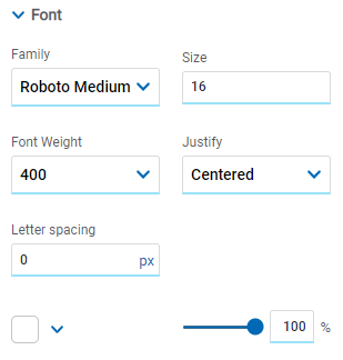
It allows to define the text style.
Background Color

It allows to add a background color to the element.
•Color
•Transparency
Edges
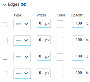
It allows to define the style of borders. Each one has its type, width, color and opacity defined, the latter as a percentage.
![]() Allows the value entered in one of the borders to be copied to the other ones automatically.
Allows the value entered in one of the borders to be copied to the other ones automatically.
![]() Allows to indicate different values for each border.
Allows to indicate different values for each border.
Round Edges
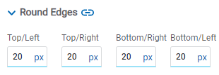
It allows to define the round edges at the corners of elements.
It can be expressed in pixels (px), percentage (%), viewport width (vw), and viewport height (vh).
![]() Allows the value entered in one of the borders to be copied to the other ones automatically.
Allows the value entered in one of the borders to be copied to the other ones automatically.
![]() Allows to indicate different values for each border.
Allows to indicate different values for each border.
Shadow
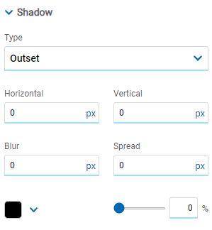
Allows to define a shadow effect around the element.
Type
Possible Values
•Outset
•Inset
Horizontal
Horizontal size of the shadow to the right of the element. It can be expressed in pixels (px), percentage (%), viewport width (vw), and viewport height (vh).
Vertical
Vertical size of the shadow below the element. It can be expressed in pixels (px), percentage (%), viewport width (vw), and viewport height (vh).
Blur
The greater this value is, the greater and lighter the shadow becomes. If not specified, its value is 0 and the shadow border is darker. It can be expressed in pixels (px), percentage (%), viewport width (vw), and viewport height (vh).
Spread
Positive values will cause the shadow to expand and grow bigger, while negative values will cause the shadow to shrink. If not specified, its value is 0 and the shadow will have the same size as the element.
Color
Defines the color of the shadow.
Transparency
Defines the transparency of the shadow.
Configuration Properties
The configuration properties panel of an element opens when clicking the icon ![]() of the context menu.
of the context menu.
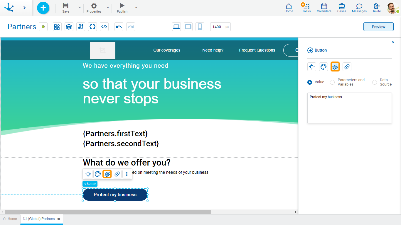
Allows to select the source of the element's content.
Value
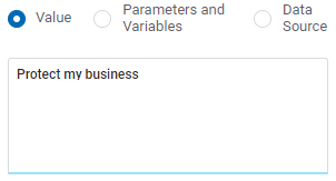
Value
Allows to enter a text that is displayed in the element.
Parameters and Variables
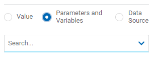
Parameters and Variables
Allows to select a parameter or a variable from the page. Its value is displayed in the element.
Data Source
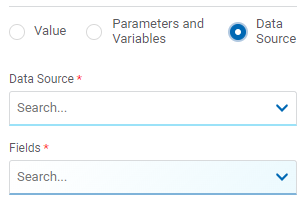
Data Source
Allows to select a data source that was previously defined on the page.
Fields
Allows to select a field from those retrieved in the chosen data source. Its value is displayed in the element.
Hyperlink Properties
The hyperlink properties panel of an element opens by pressing the icon ![]() of the context menu.
of the context menu.

Define the behavior of the element when selecting it. Different properties are enabled depending on the type of object selected.
Page

Page
The pages modeled in the environment are displayed.
Target Type
The available options for opening the object are displayed.
Possible Values
•Same Tab
•New Window
•Modal: if this option is selected the additional properties are enabled.
Modal Horizontal Size
Define its width.
Modal Vertical Size
Define its height.
•Iframe: this option is selected and an additional property is enabled.
Target Iframe
Displays the iframes previously defines in the page.
Deyel Page

Deyel Page
The pages belonging to Deyel are displayed.
Target Type
The available options for opening the object are displayed.
Possible Values
•Same Tab
•New Window
•Modal: if this option is selected the additional properties are enabled.
Modal Horizontal Size
Define its width.
Modal Vertical Size
Define its height.
•Iframe: this option is selected and an additional property is enabled.
Target Iframe
Displays the iframes previously defines in the page.
Form
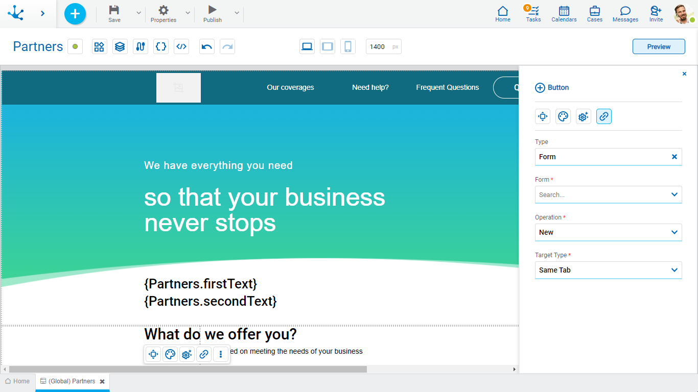
Form
The forms modeled in the environment are displayed.
Operation
Defines the operation made when selecting the object.
Possible Values
•New: Indicates that the panel of the form selected in the previous property is opened for the creation of an instance.
•Grid: Indicates that the grid of the form selected in the previous property is opened.
Target Type
The available options for opening the object are displayed.
Possible Values
•Same Tab
•New Window
•Modal: if this option is selected the additional properties are enabled.
Modal Horizontal Size
Define its width.
Modal Vertical Size
Define its height.
•Iframe: this option is selected and an additional property is enabled.
Target Iframe
Displays the iframes previously defines in the page.
Process

Process
The processes modeled in the environment are displayed.
Operation
Defines the operation made when selecting the object.
Target Type
The available options for opening the object are displayed.
Possible Values
•Same Tab
•New Window
•Modal: if this option is selected the additional properties are enabled.
Modal Horizontal Size
Define its width.
Modal Vertical Size
Define its height.
•Iframe: this option is selected and an additional property is enabled.
Target Iframe
Displays the iframes previously defines in the page.
Link
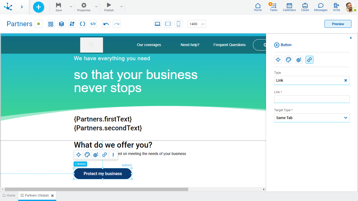
Link
Allows to enter any link.
Target Type
The available options for opening the object are displayed.
Possible Values
•Same Tab
•New Window
•Modal: if this option is selected the additional properties are enabled.
Modal Horizontal Size
Define its width.
Modal Vertical Size
Define its height.
•Iframe: this option is selected and an additional property is enabled.
Target Iframe
Displays the iframes previously defines in the page.
Element

Element
The modeled elements in the page are displayed.
Operation
Defines the operation made when selecting the element.
Possible Values
•Focus
•Show
•Hide
•Show/Hide
Behaviour
Establishes the transition of the animation.
Possible Values
•Auto
•Smooth
Vertical Scroll
Possible Values
•Start: Moves to the start of the selected element.
•Closest: Moves to the closest position to the selected element from the element the event fires.
•Center: Moves to the center of the selected element.
•End: Moves to the end of the selected element.
Back

It allows associating the event to go back in the browser to the element.
Events
The buttons allow to use different events.
Event |
Description |
|---|---|
onMouseIn() |
It is executed when the cursor is positioned on the element. |
onMouseOut() |
It is executed when the cursor moves out of the element. |
onClick() |
It is executed when clicking on the element. |
onDoubleClick() |
It is executed when clicking twice on the element. |
onInit() |
It is executed before the element is loaded. |
afterViewInit() |
It is executed after viewing the element. |
onViewportEnter() |
It is executed when the element is visible. |
onViewportLeave() |
It is executed when the element is no longer visible. |
