Lines
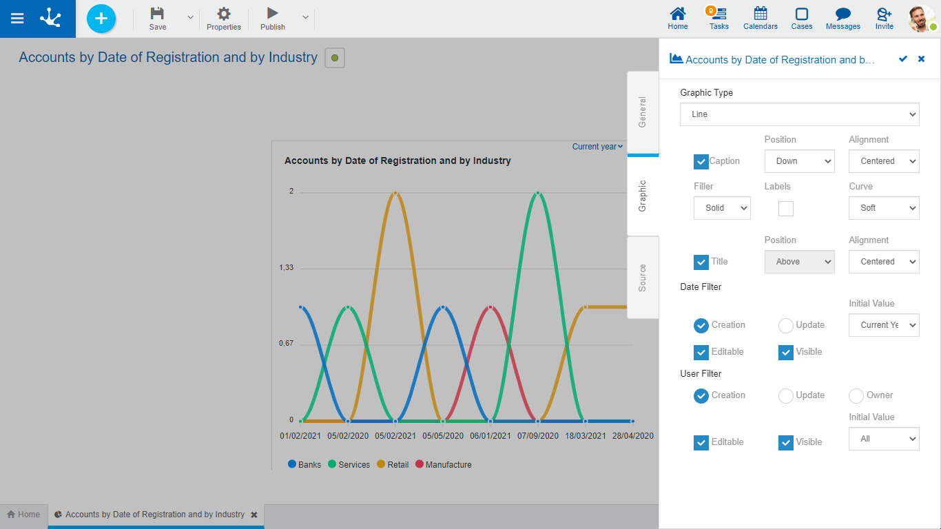
The lines type widgets comprehend line and stacked line graphics. They have properties common to all graphics and specifics.

Specific Properties
Legend
Indicates the incorporation of the data series description.
If this property is selected, it must also indicate:
Position
Select up, down, left, right.
Justify
If up or down position is selected, it allows to indicate right, center or left alignment.
Filling
Allows to highlight the area of data series in a gradient or solid way.
Label
Allows to indicate whether the labels corresponding to the data series are displayed.
Curve
Indicates whether data lines are displayed as smooth, straight, or stepwise curve.
Title
If this property is selected, when using the widget on a dashboard, the descriptive name is displayed.
In this case it must also indicate:
Position
Allows to locate the title in the upper or lower sector of the widget area.
Justify
Allows to position the title to the right, center, or left, within the widget area.
Example of Use
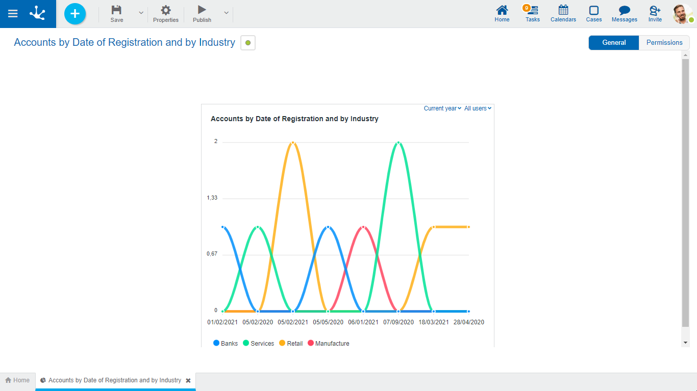
In this line graphic the number of CRM accounts entered per day and by industry is displayed, for a selected period and for the users indicated in the filter.
On the horizontal axis are represented the registration dates and on the vertical axis the sum of the registrations made.
The height of the line for each industry indicates the total number of discharges per day.

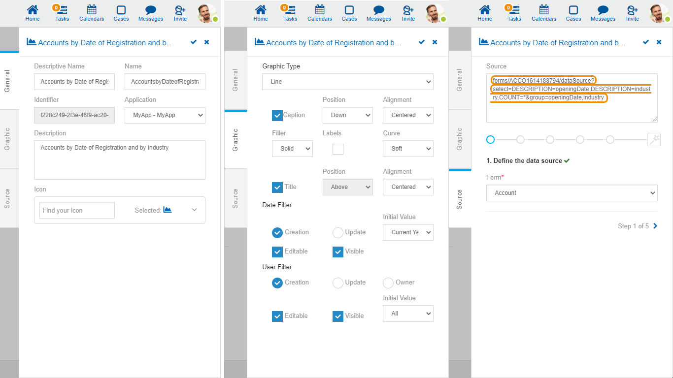
The source code to model this graphic is detailed.

In the "Source" tab, each orange box represents the code for a particular step.
