Layout
This element is a structure built of a set of items and allows to structure them based on different styles: column, row, stripe and mosaic. Such items are containers, which allows to add other elements. These elements can be moved with each item when the layout structure is resized.
The element properties are represented by icons in its context menu, where its operations are also available.
Subtypes
•Column
•Row
•Stripe
•Mosaic
Structure Properties
The structure properties panel of an element opens when selecting the icon  of the context menu.
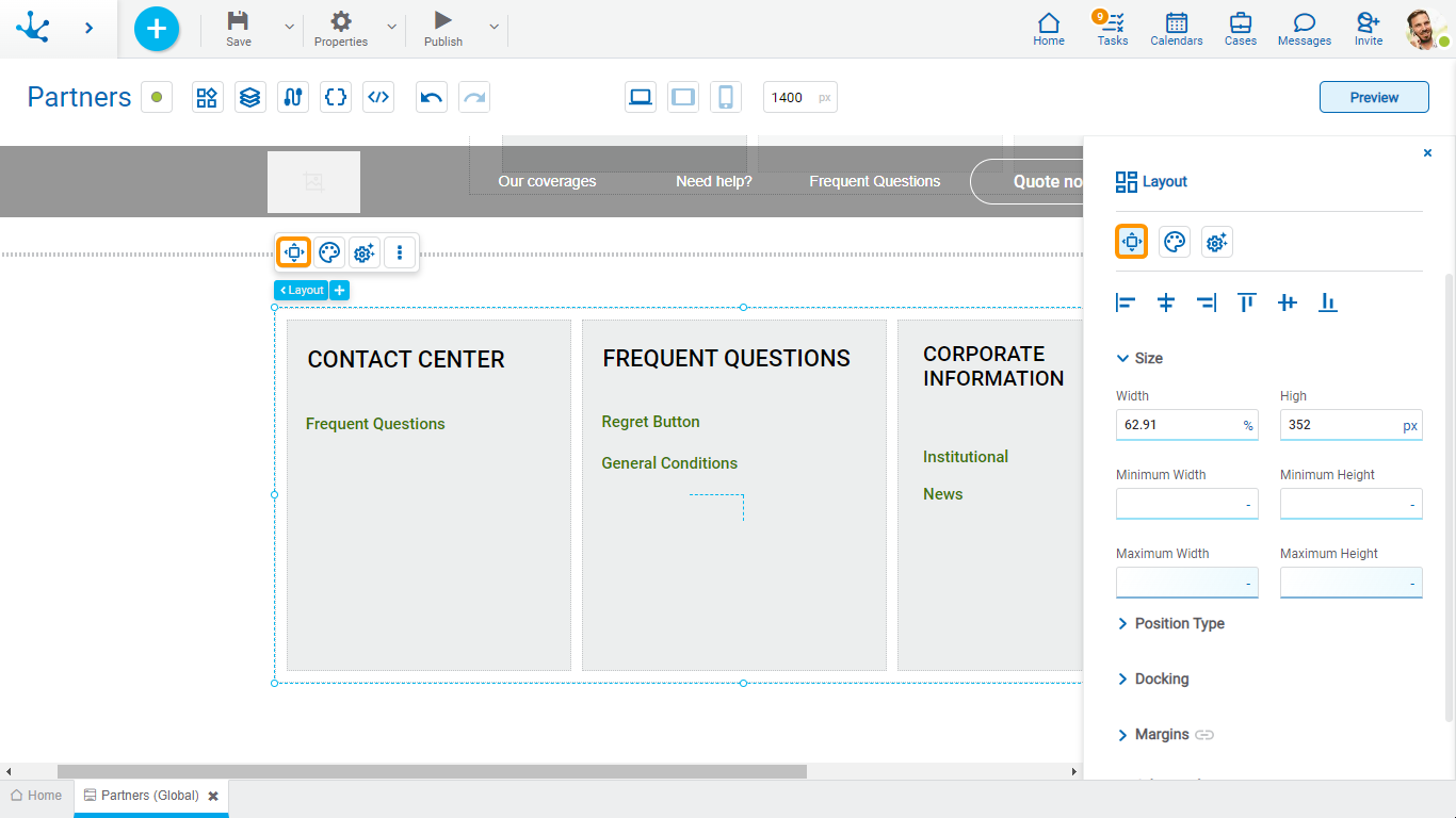
Alignment
Allows to align the element by selecting one of the available icons.
• Align to the left.
• Align to horizontal center.
• Align to the right.
• Align up.
• Align vertical center.
• Align bottom.
Size
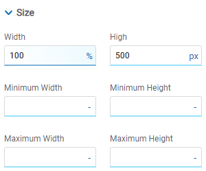
All size properties can be expressed in pixels (px), percentage (%), viewport width (vw), and viewport height (vh). Additionally, for Width and Height properties, the “auto” option is added.
Position Type
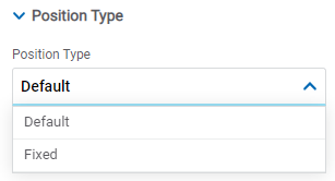
Possible Values
•Default: The element has a relative position with respect to the superior element where it was placed (container or section).
•Fixed: Fixes the element to the page so that it is always visible in the same position. It allows to increase the visibility of important content.
Docking
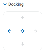
Determines the vertical and horizontal position of elements within the page section or container, when the screen is resized.
Although the modeler automatically docks the element when it is added, it can also be configured in order to be docked to any side (to the top, bottom, left, right, or even in the center of the section or container it is in). Just click on the arrows or in the center of the side to be docked to.
Margins

It allows to define the distance of elements from the borders of their top element. The behavior of margins depends on the docking of the element. It can be expressed in pixels (px), percentage (%), viewport width (vw), and viewport height (vh).
Top
Distance to the top border of the highest ranking element.
Bottom
Distance to the bottom border of the highest ranking element.
Left
Distance to the left border of the highest ranking element.
Right
Distance to the right border of the highest ranking element.
![]() Allows the value entered in one of the margins to be copied to the other ones automatically.
Allows the value entered in one of the margins to be copied to the other ones automatically.
![]() Allows to indicate different values for each margin.
Allows to indicate different values for each margin.
Advanced
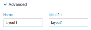
Name
Name used to reference the element during modeling.
Identifier
Uniquely identifies the element. It is used in the Javascript SDK.
Style Properties
The style properties panel of an element opens when selecting the icon  of the context menu.
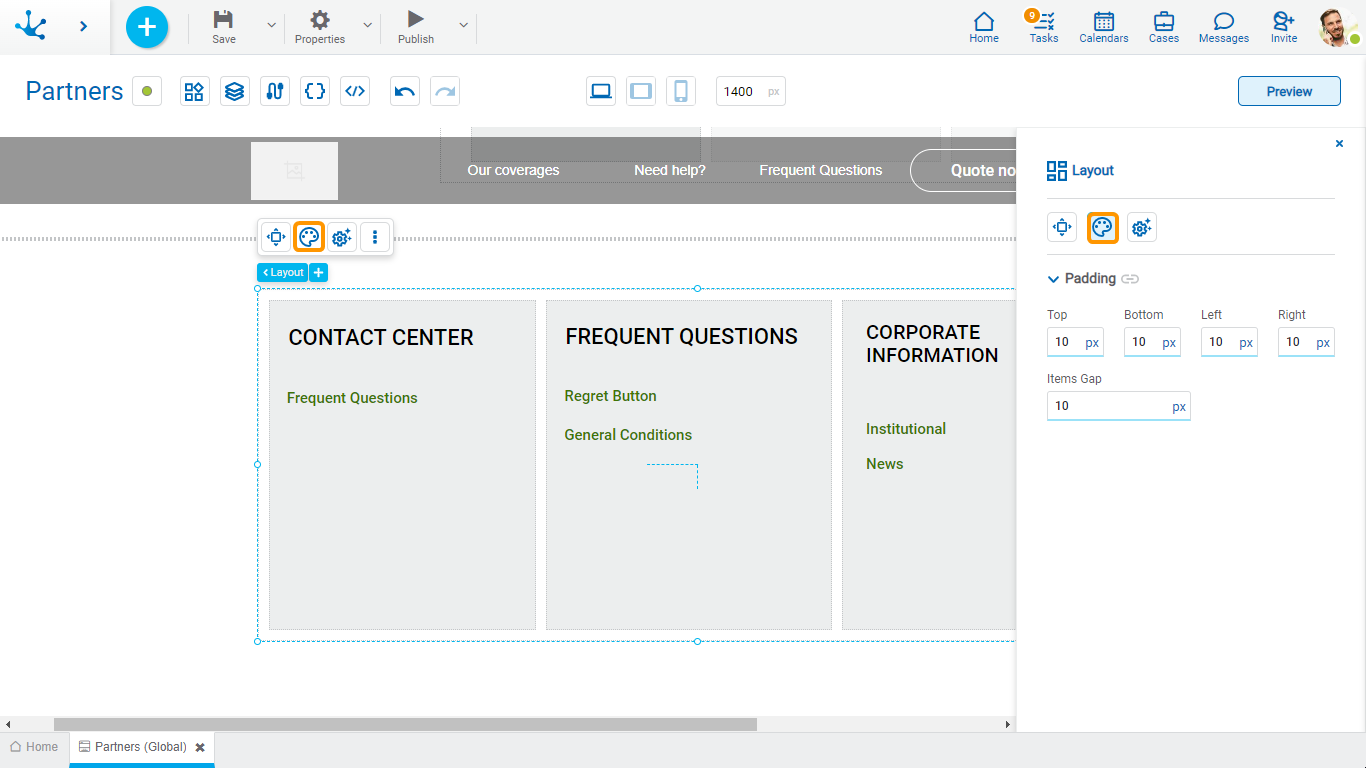
Padding
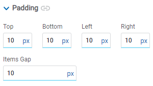
All padding space properties allow you to create a space around the borders (top, bottom, sides) and the bottom elements. It can be expressed in pixels (px), percentage (%), viewport width (vw), and viewport height (vh).
Items Gap
Defines the gap between the design items.
![]() Allows values entered in one of the paddings to be copied to the other ones automatically.
Allows values entered in one of the paddings to be copied to the other ones automatically.
![]() Allows to indicate different values for each padding.
Allows to indicate different values for each padding.
Configuration Properties
The configuration properties panel of an element opens when clicking the icon ![]() of the context menu.
of the context menu.
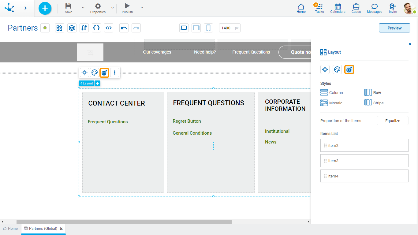
Styles
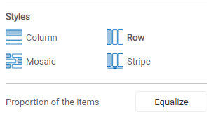
Indicates the style type.
Proportion of the items
Pressing the “Equalize” button adjusts the size of the items proportionally within the layout.
Items List
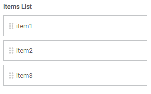
The items contained in the design are visualized and can change position by dragging them within the list.
